Identity & Colours
PHOTOGRAPHY:
Mito
Originally, the Basque word “urdin” described the colors blue, green and grey. “Urdin” means “like water”, and from there this refers to the different tones that can be reflected in a transparent liquid: “urdin” was the color of grey locks of hair but also of the raging sea in winter or a lake between summer pastures. All colors have a meaning and this meaning depends on the context. A red can be erotic or in inappropiate. Yellow, oppressive or therapeutic. Green, poisonous or hypnotic. There are as many colors as there are there are gazes.
A new chromatic universe
Colors, they say, are an illusion created to understand reality. Like illusions, colors are profoundly subjective. Each color enjoys a meaning according to the eyes, the culture or the sensibility of the person who sees it. Two people never see the same violet, nor the same green, let alone coincide when referring to the same tone of black.
Nevertheless, exists chromatic harmony. The chromatic harmony is the equilibrium that one obtains when the right colors are combined. It is consonance, it is calm, it is a piano perfectly in tune.
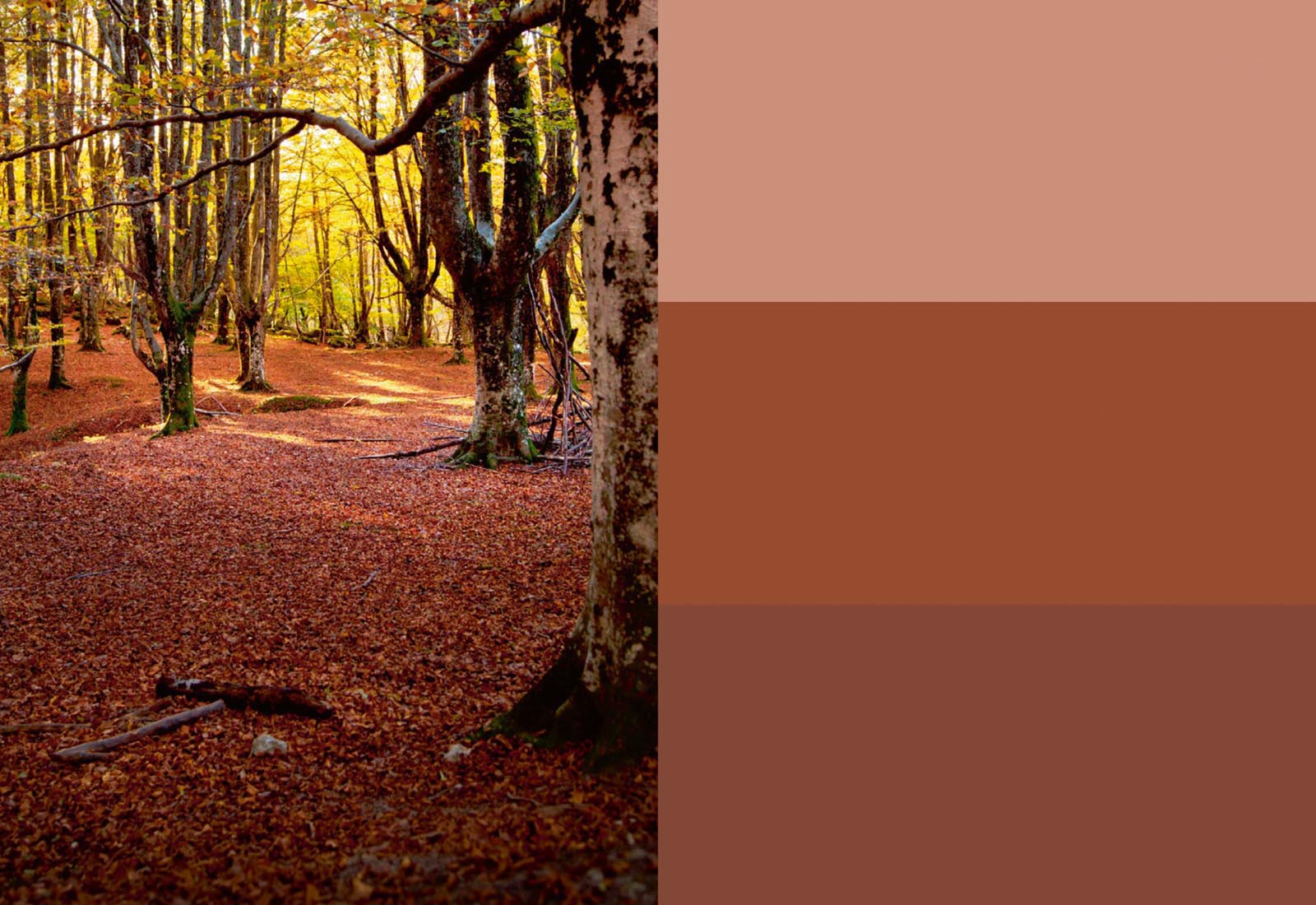
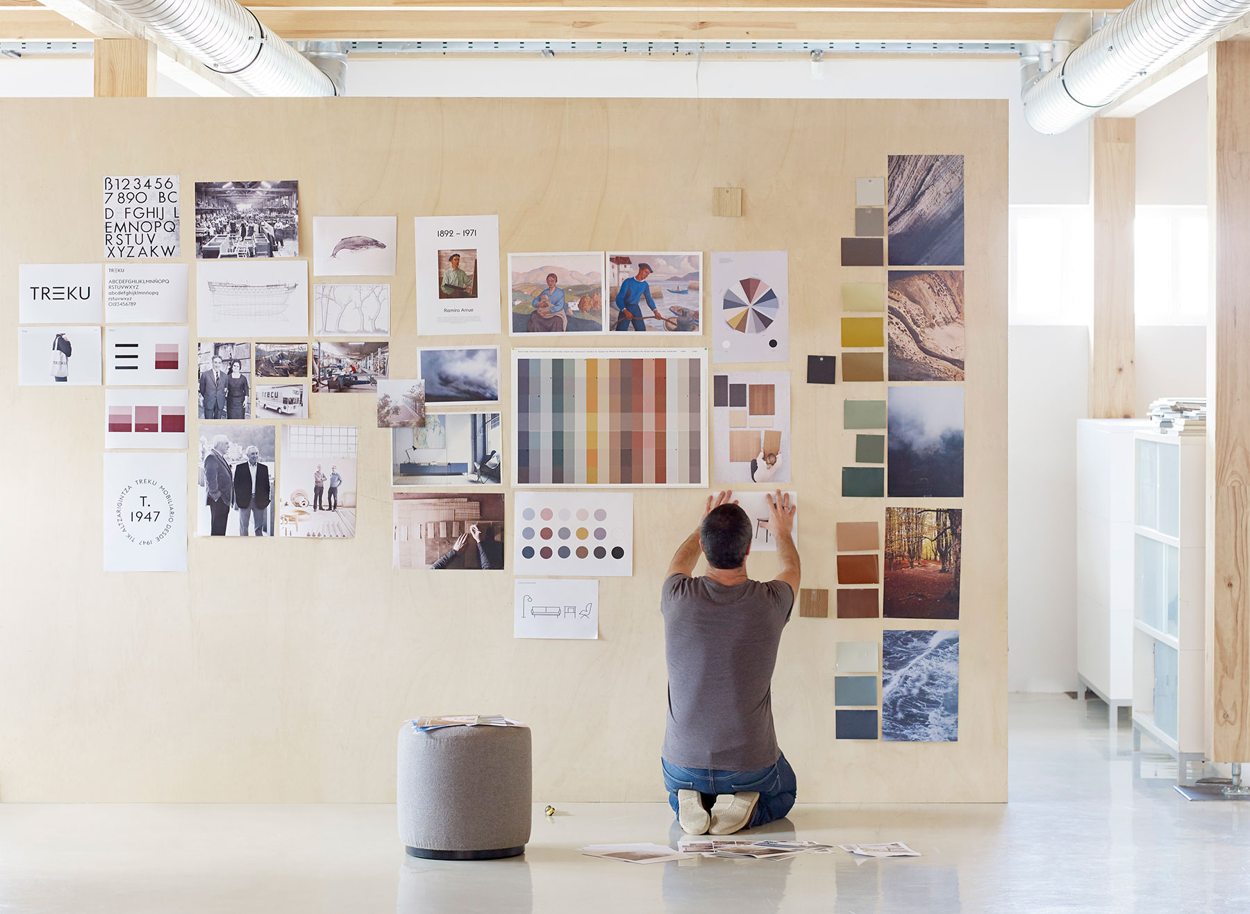
During this last year at Treku, we have studied a pallet of colors. On one side, we want to amplify the chromatic variations of out furniture and offer our clients a wider array of possibilities. On the other, we need for the new pallet to be profoundly coherent, like a family tree in that all parts have a blood as well as sentimental relationship. We want total harmony.
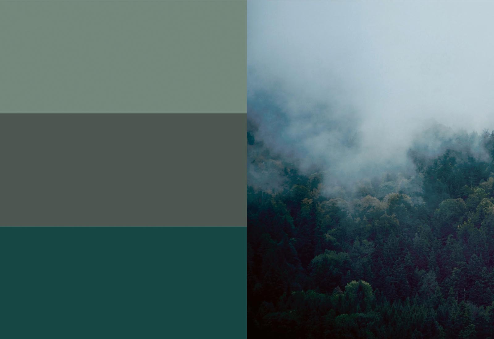
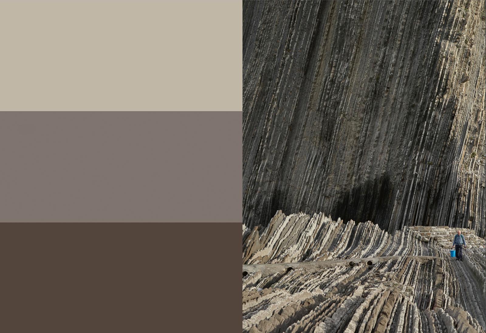
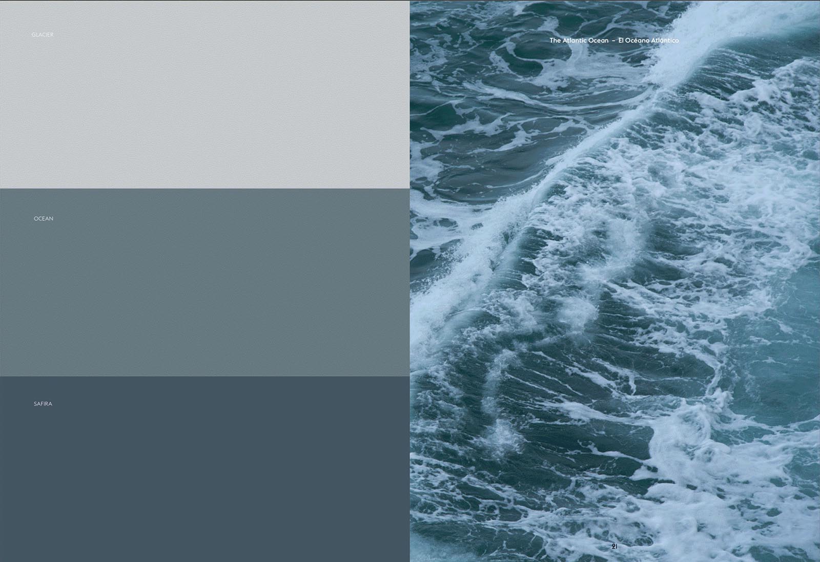
Fruit of this year’s work and reflection is the organization of the colors that we present here: five ranges – blues, greens, reds, yellows and neutrals – each one of which steps down through three nuanced levels of saturation. To find the adequate colors we simply had to look around at our surroundings, our sea, our forest, our leaf piles, our beaches and cliffs.
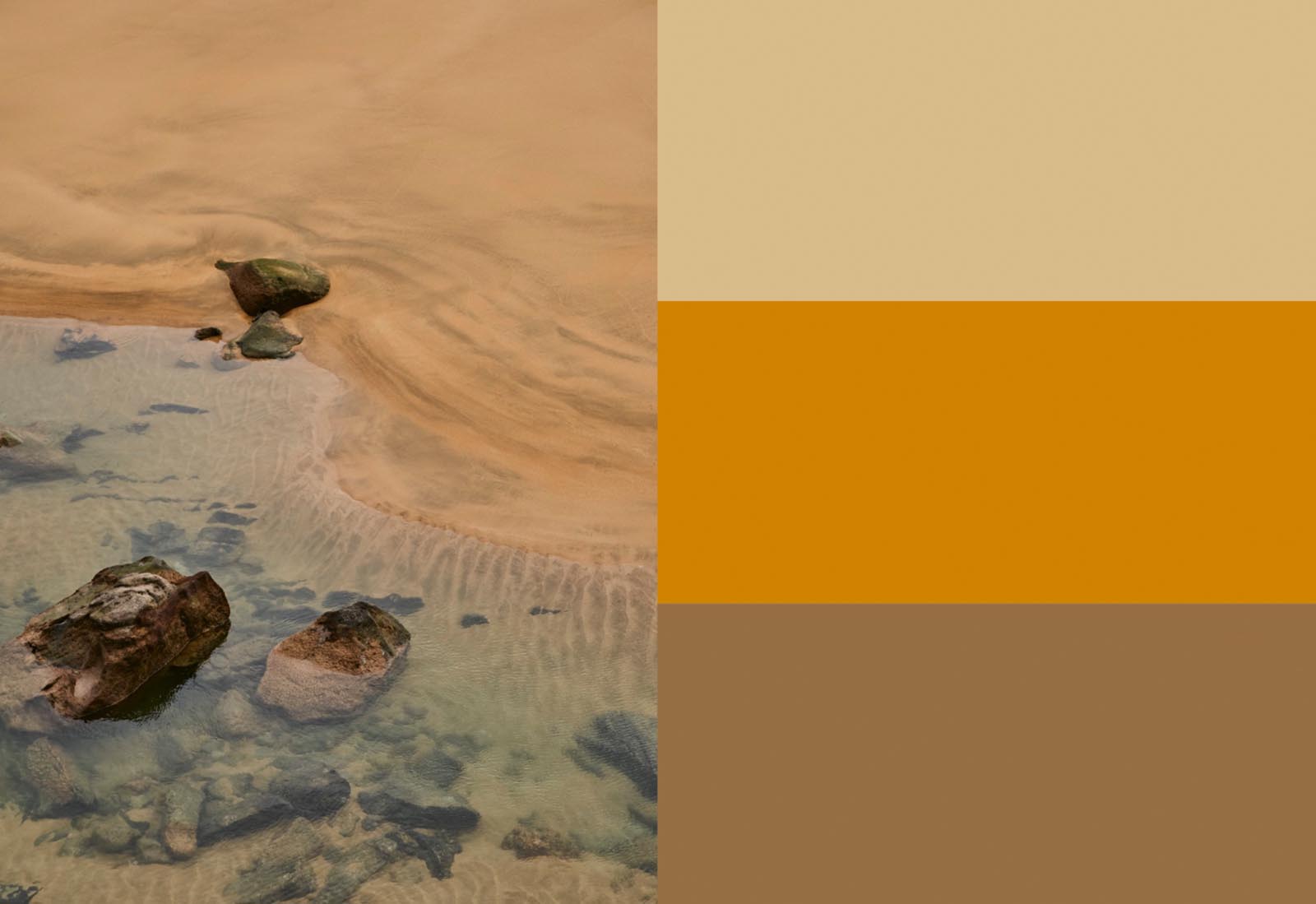
Also, at our skies: in the Basque Country it rains more than half the days of the year. The clouds are a habitual presence on our horizon and help inundate out landscape with a very special light, subtly shaded, without barely stridency, with smooth contrasts and delicate saturations. Our new color palette is an expression of all of that and the necessity to create spaces with soul through our furniture.
