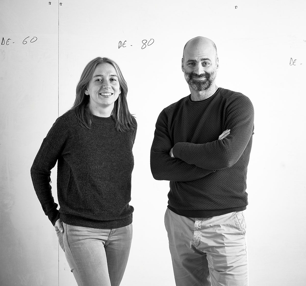
Getting closer to Estudi Manel Molina

Getting closer to Estudi Manel Molina

PHOTOGRAPHY:

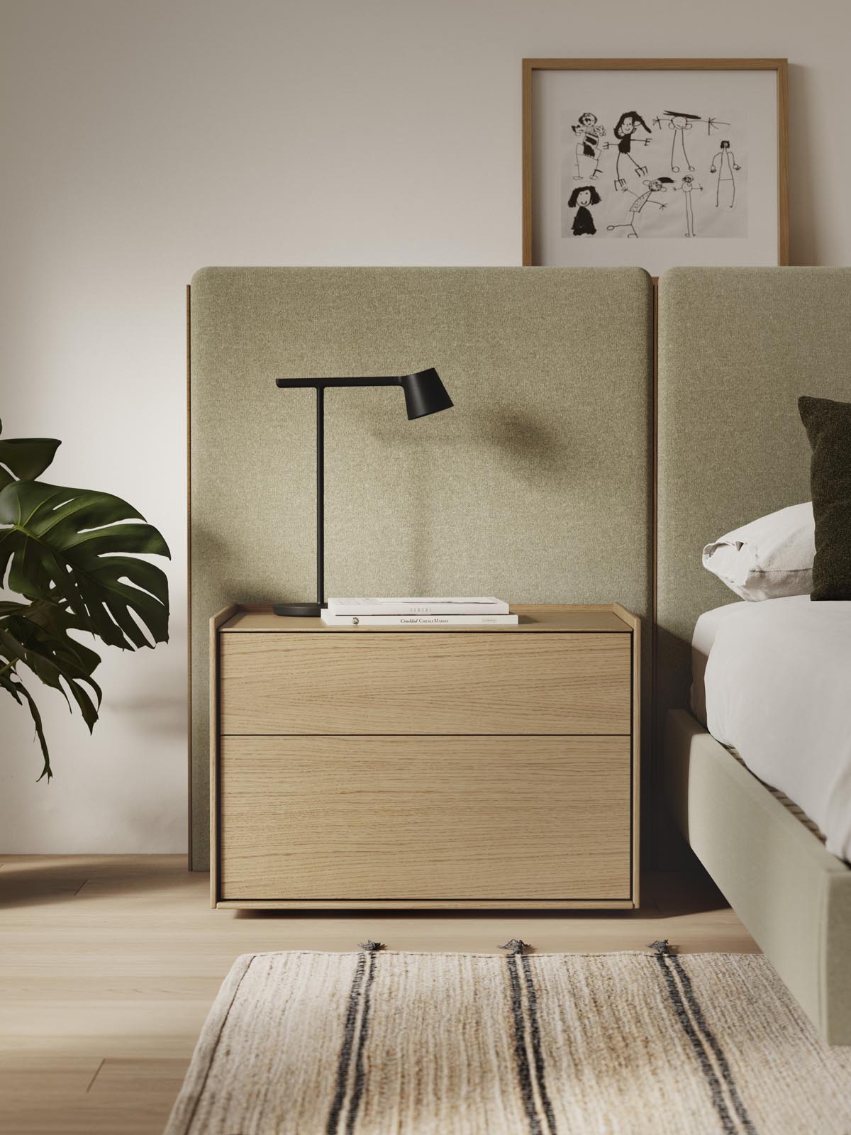
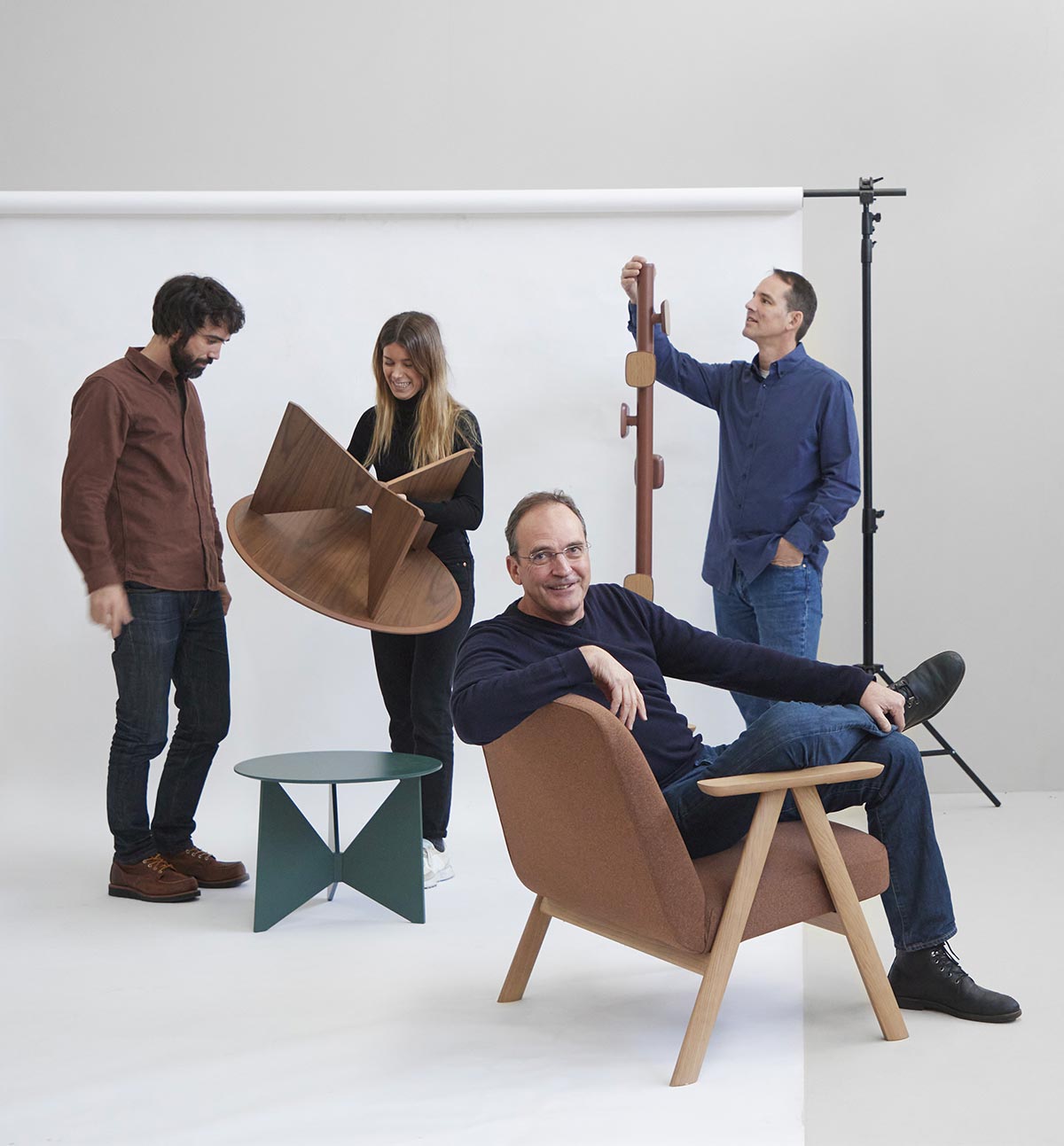
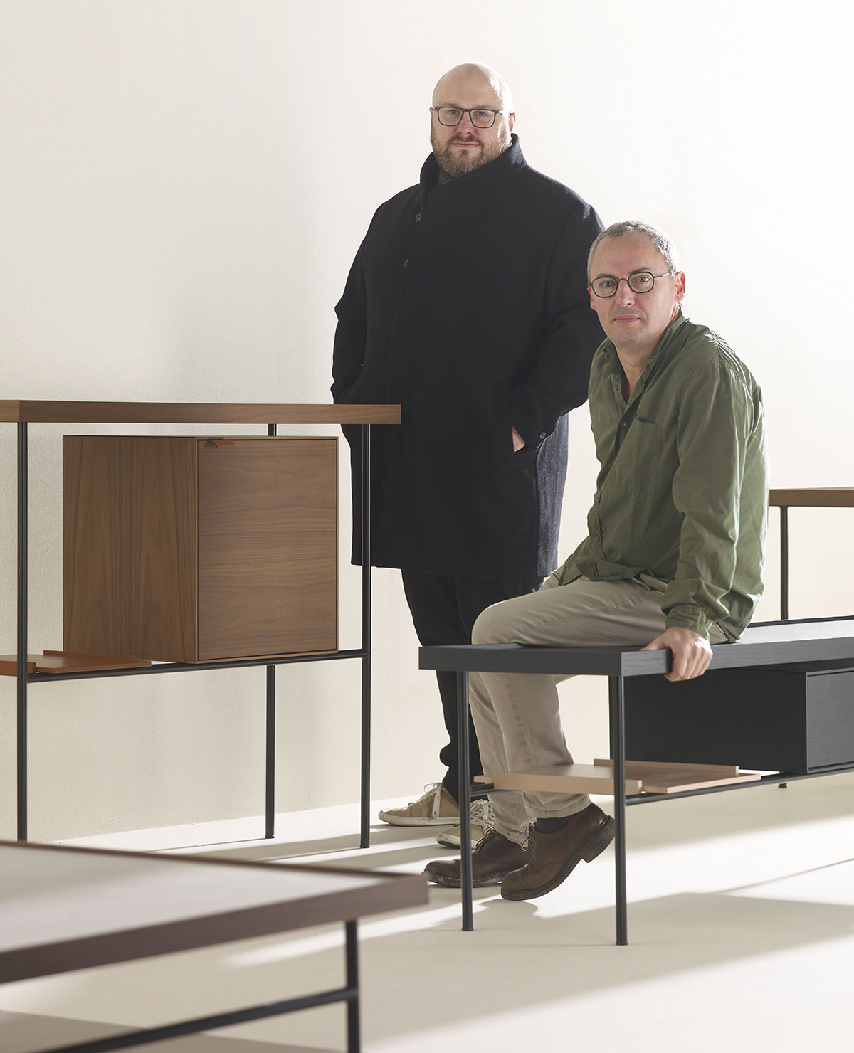
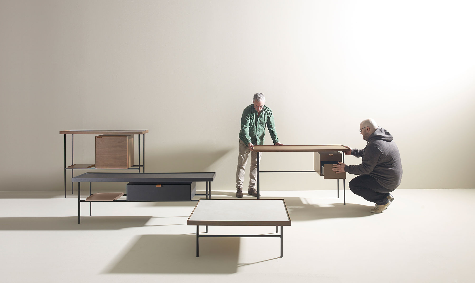
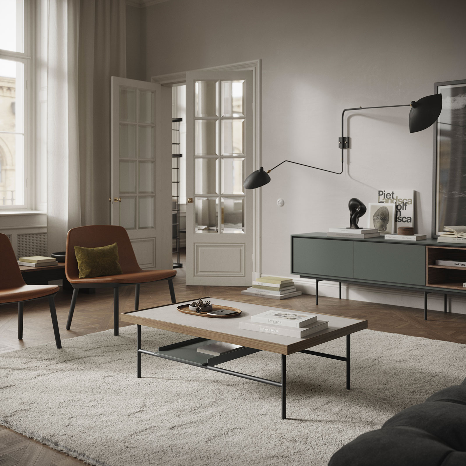
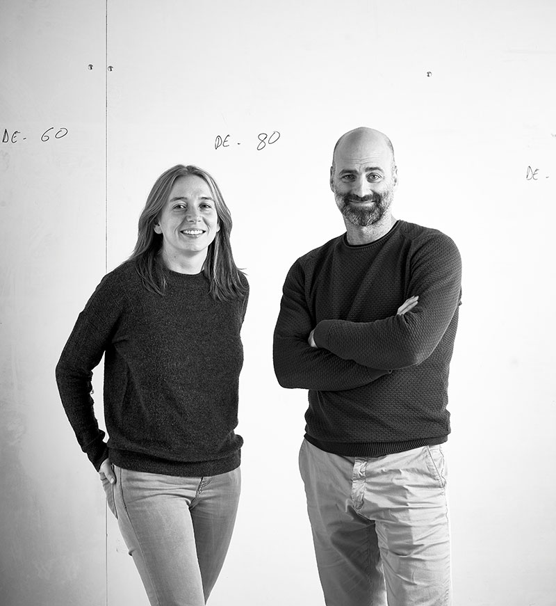
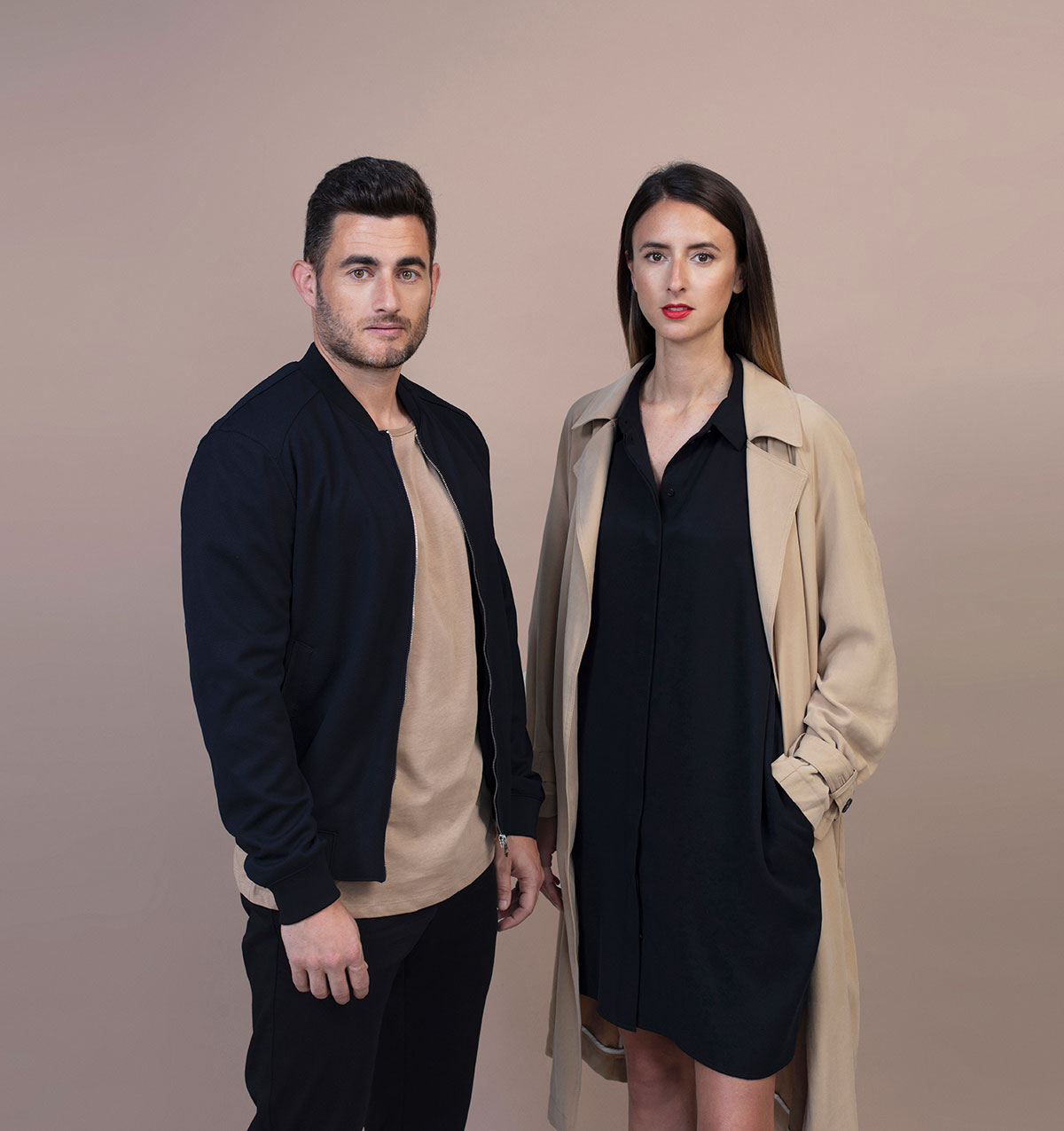
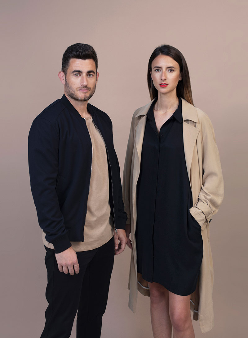
(Above) The Estudi Manel Molina with Treku news

Manuel Molina has been involved in the world of design and décor for more than forty years. In 2016, he founded his own studio in partnershvip with Ramon Monsarro, Daniel Castro and Blanca Roigé. This collaboration has resulted in the Hiru tables, Leku chair and Goi coat rack, which they have created for Treku.

PHOTOGRAPHY:

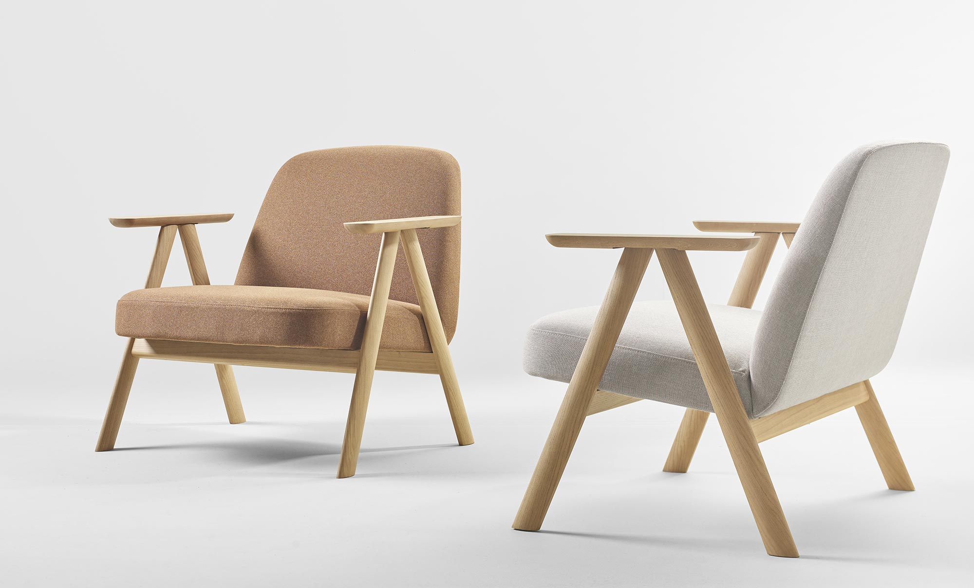
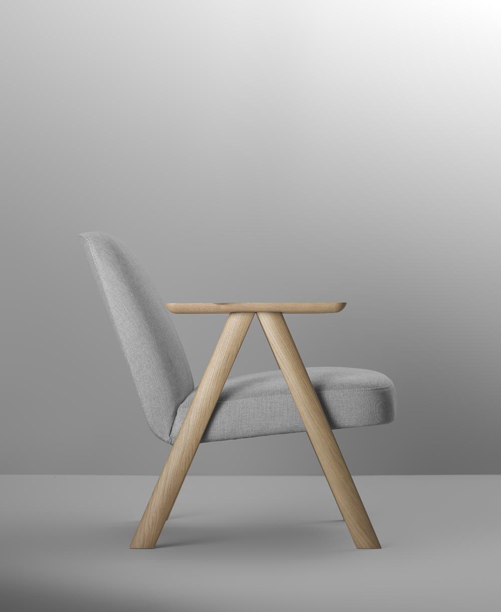
(Above) The Leku lounge chair

Design is like trying to dance well with your feet tied together. You have to feel the function – such as comfort – and draw its shapes, taking into account the techniques and processes that are involved in its creation. You also have to find the simplest route, to achieve the right cost. It is not easy to work with as well-established a brand as Treku, because its catalogue is thoroughly studied and its style is very distinctive.
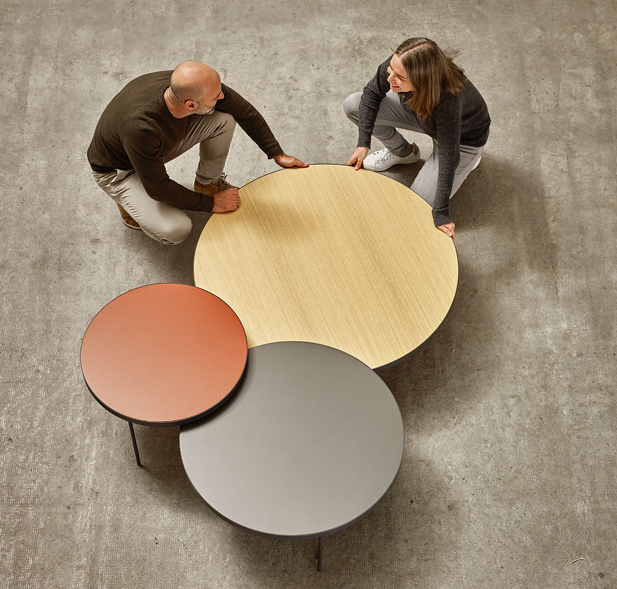
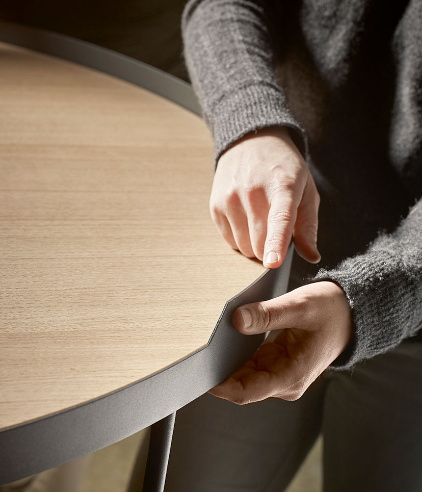
The most sustainable furniture is well-designed furniture. Fashion is an increasingly prominent variable in the world of design, but it’s like an epidemic: it makes everything transient and strident. The furniture we design is discreet and calm. It uses few materials, includes a lot of colour, and its shapes are coherent and timeless, so they will last over time.

PHOTOGRAPHY:

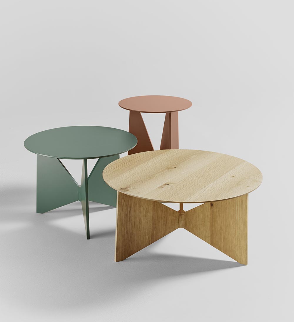
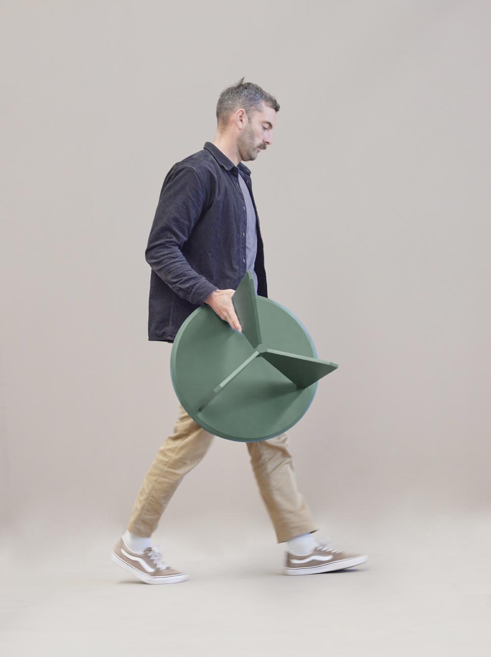
(Above) Hiru Coffee Tables

Hiru Coffee Table

I have long legs – I like to sit on the sofa and stretch them out. hat’s why I don’t have a table at home that would get in the way. I mentioned to Gorka that I was looking for a small side table for a whisky glass, book or remote control… and before we knew it, we were designing a new family of tables.

Leku Lounge Chair

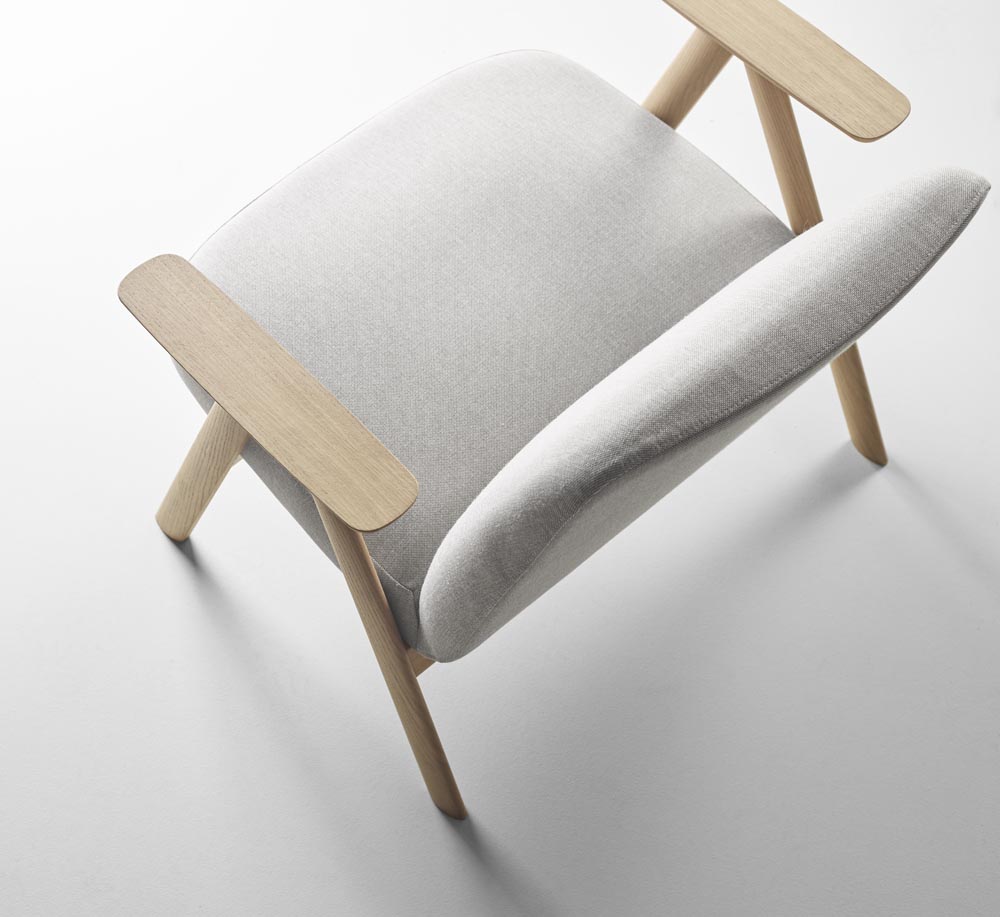
The Leku armchair is a very versatile chair that can work in the home or the contract sector, which we call the ‘public home’: communal areas and rooms in hotels, modern offices and so on. We like to say that Treku is ‘home-ifying’ hotels.

The initial idea was for the Leku armchair to form part of the Bisell family, a collection we had already designed for Treku and which, thanks to its simplicity, was performing very well on the market. But as the design evolved, we could see that Leku had its own character. We then decided to truly embrace comfort, so we added simple armrests and gave it wider proportions and high-density foam over the whole seat.

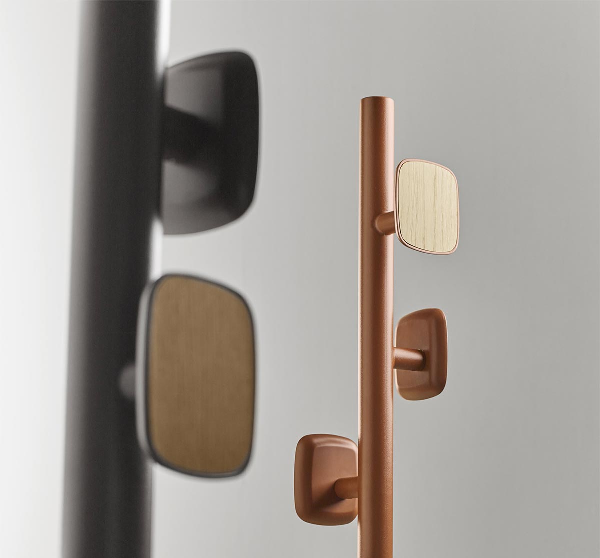
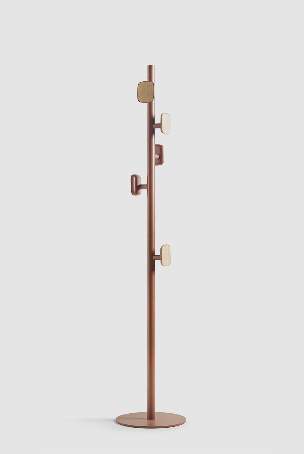
Goi Coat Rack

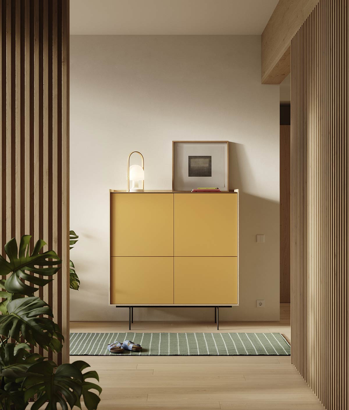
It’s like seasoning for the Treku environment. We wanted to design something fun, so that the brand could offer end customers the possibility of playing around with Treku’s different lacquers and woods. An attractive and lighthearted item.

Homes are getting smaller and smaller, with less storage space, and that is a factor too (or a benefit, depending on how you look at it) when it comes to designing things. Apartments have less and less floor space and it is essential to find a practical use for every little corner, whether it’s a place to hang clothes, store your motorbike helmet or stand an umbrella.

Aura Updates

Aura Updates

PHOTO:

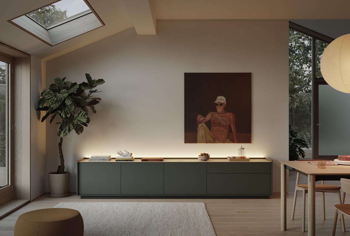
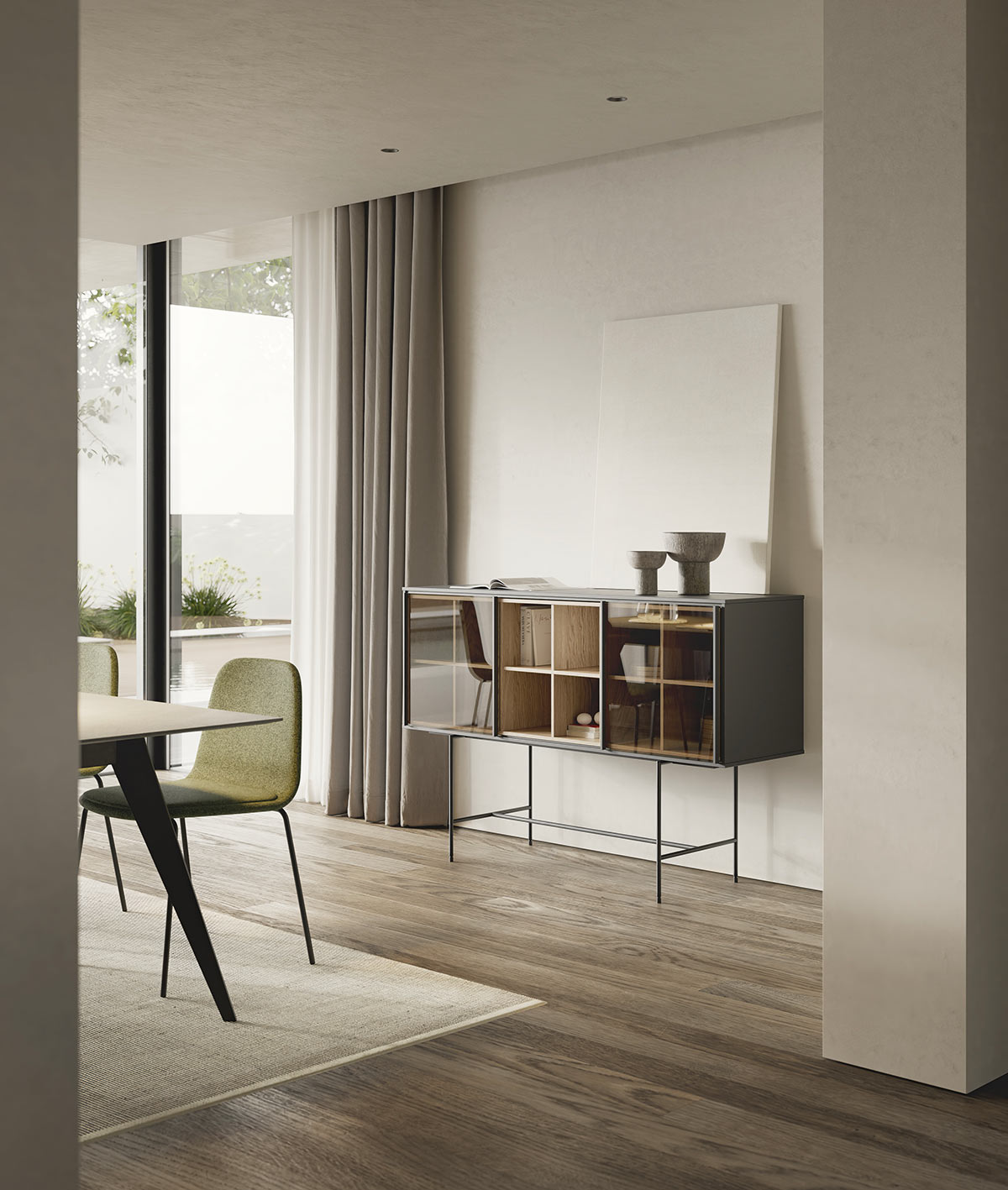
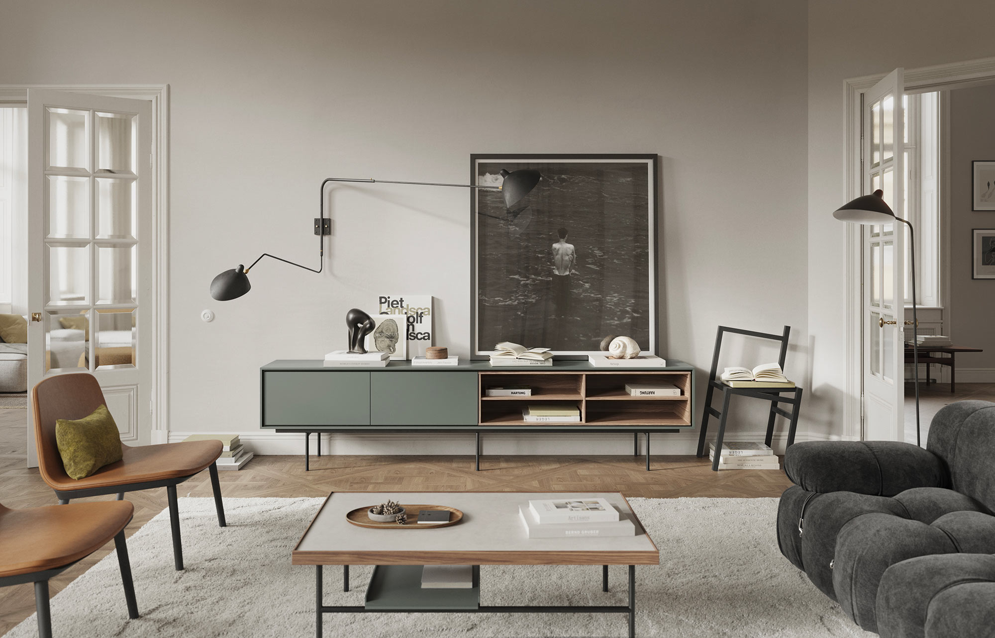
Aura sideboard in Kai black with sliding doors in smoked glass and natural oak crosspieces.

At Treku, we are constantly pushing the boundaries of design innovation, and our latest update to the Aura Collection is no exception. Our team faced a daunting challenge: how do we inject fresh, new ideas while still preserving the unique personality that has made Aura so popular? With the addition of our latest pieces this year, we are thrilled to say that we have achieved that perfect balance.

Design: Angel Martí & Enrique Delamo

PHOTO:

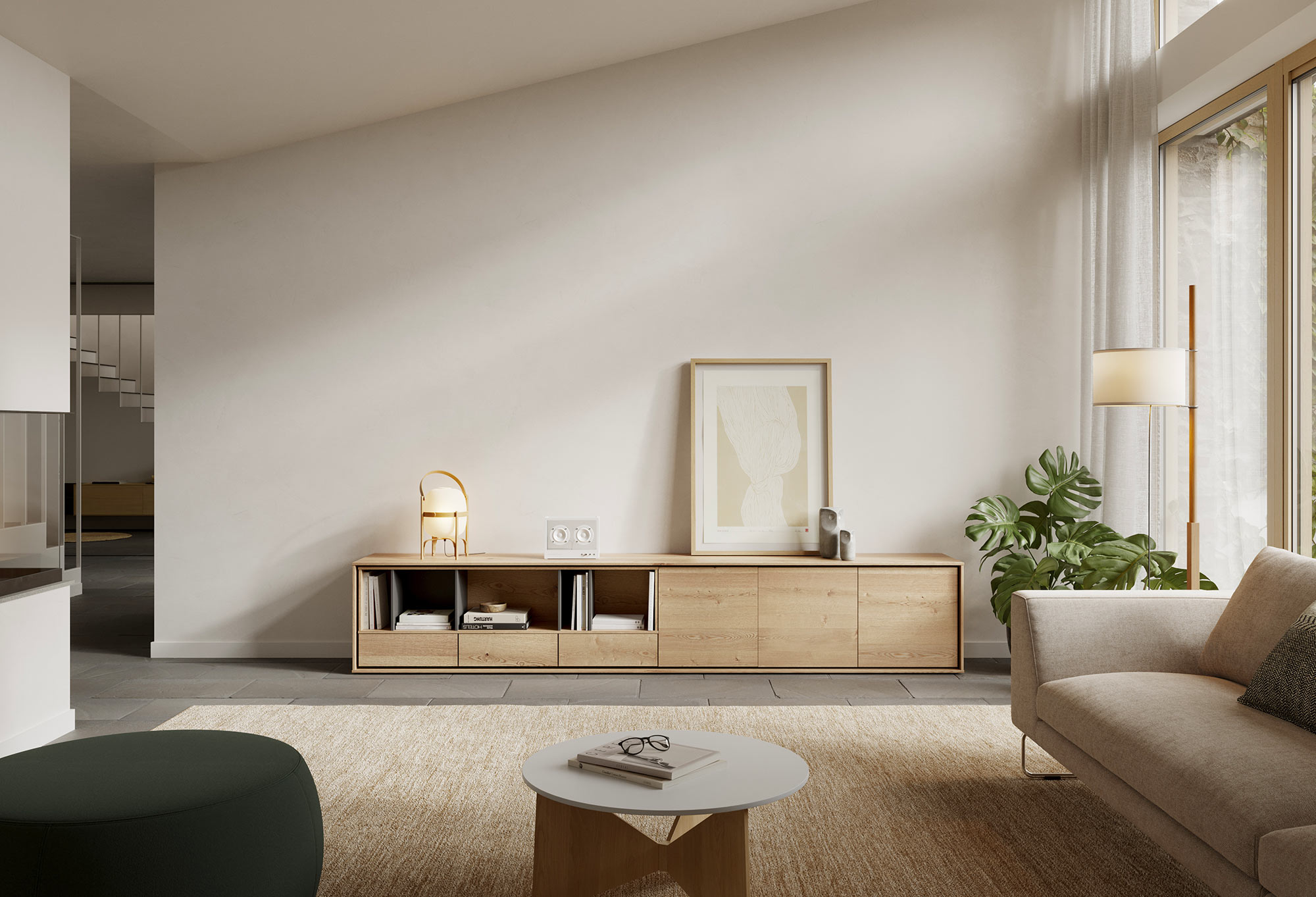
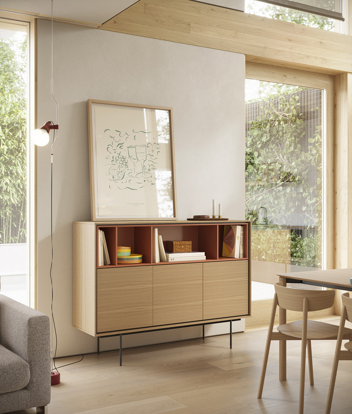
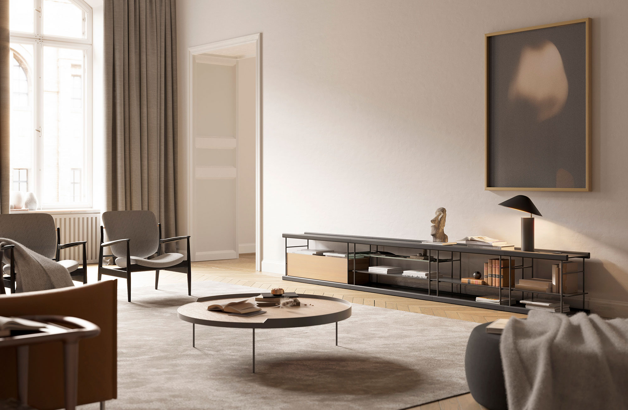
(Above) Aura low unit finished in vital oak wood.
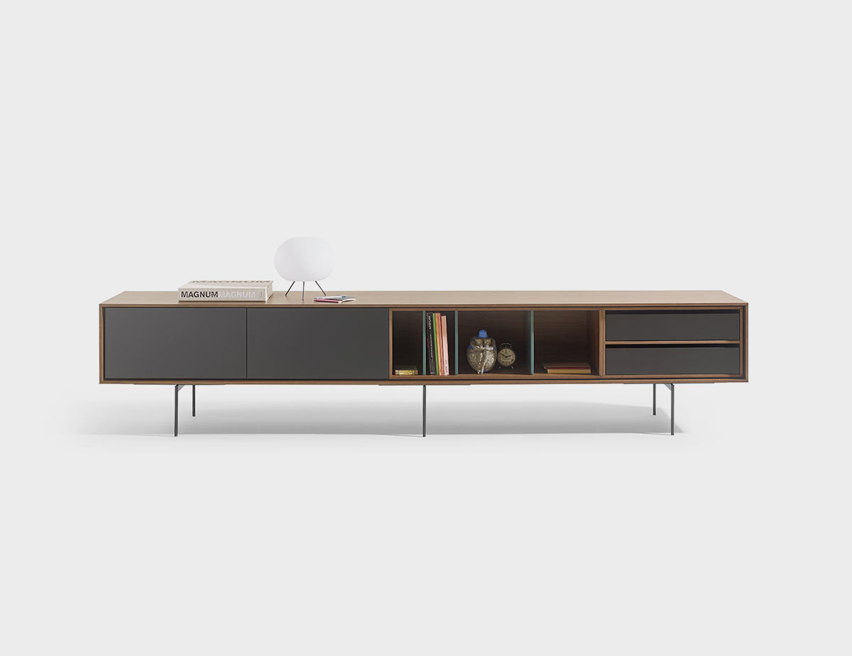
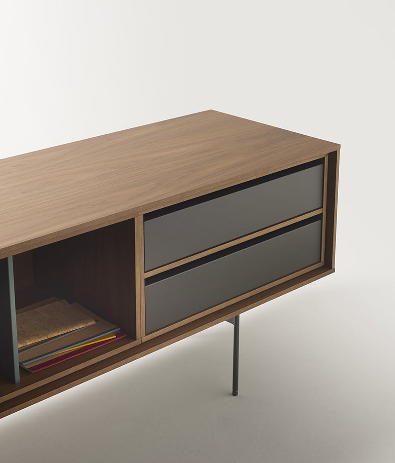
(Below) Aura media unit in walnut with drawers in graphite and dividers in Moss. Detail of new drawer units

Our drawer module boasts a top groove and our transparent dividers feature a stunning cross design, enabling you to create entirely new configurations and play with an array of materials and colours. These pieces are not only incredibly versatile, but also convey a sense of timeless, contemporary sophistication that is sure to impress.

For those looking to add a touch of style to their space, our transparent dividers with divisions are the perfect choice. These pieces are specifically designed to sit atop sideboards, providing the ideal place to showcase your most treasured items.

Kutxa Collection by Iratzoki & Lizaso

Kutxa Collection
by Iratzoki & Lizaso

PHOTOGRAPHY:

Jean Louis Iratzoki & Ander Lizaso designers of the Kutxa collection.

In 2016, after working together for several years, Jean Louis Iratzoki and Ander Lizaso created the Iratzoki Lizaso studio which specialises in several areas of industrial design: home and office furniture, lighting and ephemeral architecture. The Kutxa collection is their latest contribution to Treku.

FOTOGRAFÍA:

(Arriba) Imagen del Flysch de Zumaia, que muestra más de 60 millones de años de la historia de la Tierra.

El proceso de diseño de la colección Kutxa ha sido largo y sostenido en el tiempo. Cuando la idea surgió en nuestro estudio se la transmitimos a Treku. El diálogo con ellos es muy fluido y muy abierto, siempre lo ha sido, por lo que, con el paso de los años, hemos ido afinando el concepto inicial de Kutxa hasta llegar al producto final.

Todas las piezas que componen la colección Kutxa tienen un toque escultórico pero sin referencias directas a artistas o a sus obras. La idea es que estos muebles contribuyan a crear espacios más sosegados y cuidados, antes que una optimización del espacio de almacenaje. Nos apetecía crear una colección de muebles con diferentes figuras donde cada pieza tenía personalidad propia y cumplía una función dentro de una lógica gráfica.

Todo nace de un dibujo surgido de manera inesperada. En aquel esbozo ya se advertía la idea de una caja suspendida dentro de una estructura muy sencilla y arquitectónica. También estaba presente el juego de contrastes, entre la contundencia de la madera y la gracilidad del metal. No recuerdo en qué año sucedió todo pero todavía conservamos aquel esbozo.

FOTOGRAFÍA:

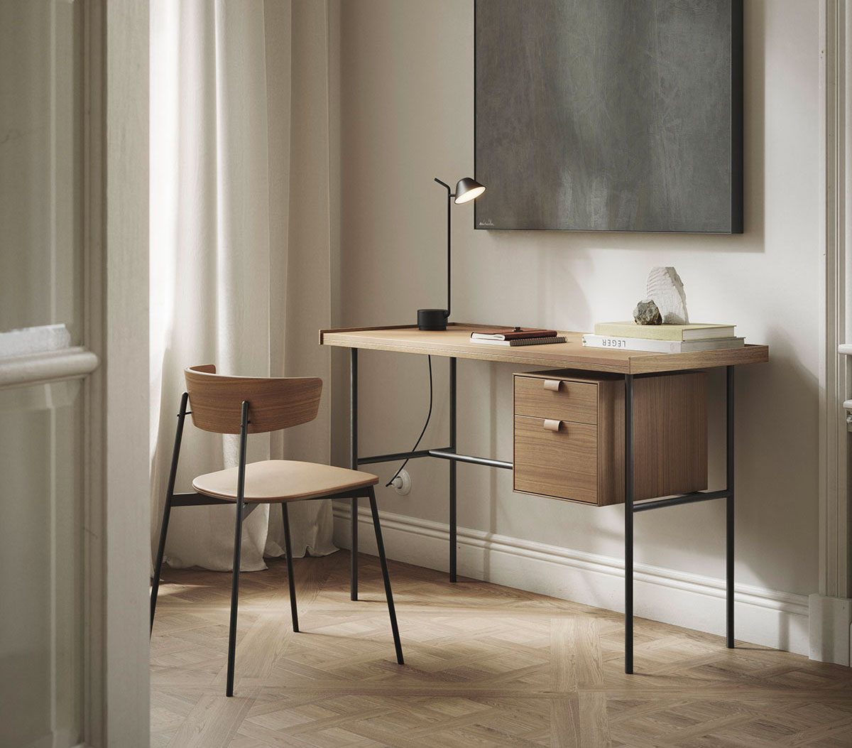
(01) Escritorio Kutxa y silla Kol, ambos en nogal.
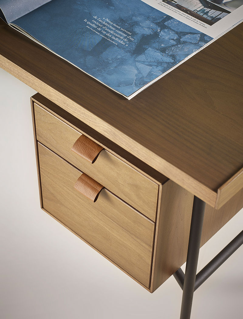
(02) Detalle de la cajonera del escritorio Kutxa y sus tiradores en piel.

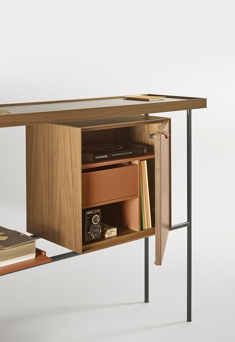
La colección Kutxa es, ante todo, un juego de contrastes: unas estructuras muy finas y esbeltas que contrastan con una caja muy voluminosa de madera que levita. La idea inicial era un juego de volúmenes más simple a la que hemos ido añadiendo los pequeños detalles que se pueden apreciar en la actualidad (los tiradores de cuero de las cajoneras, por ejemplo) que hacen el producto más cálido y cercano para el usuario.

Sólo cuando el producto ha estado maduro, lo hemos presentado. Hay marcas que trabajan con un objetivo de fechas muy concreto. En nuestra relación con Treku no ocurre así, los ritmos son más orgánicos.

En Iratzoki & Lizaso cada uno tenemos una pieza favorita porque la imaginamos en una parte diferente de nuestras casas. A Ander le gusta más la kutxa alta y voluminosa y a Jean Louis le casa mejor el escritorio.

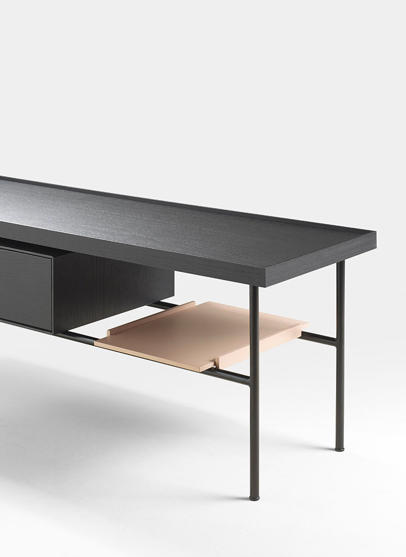
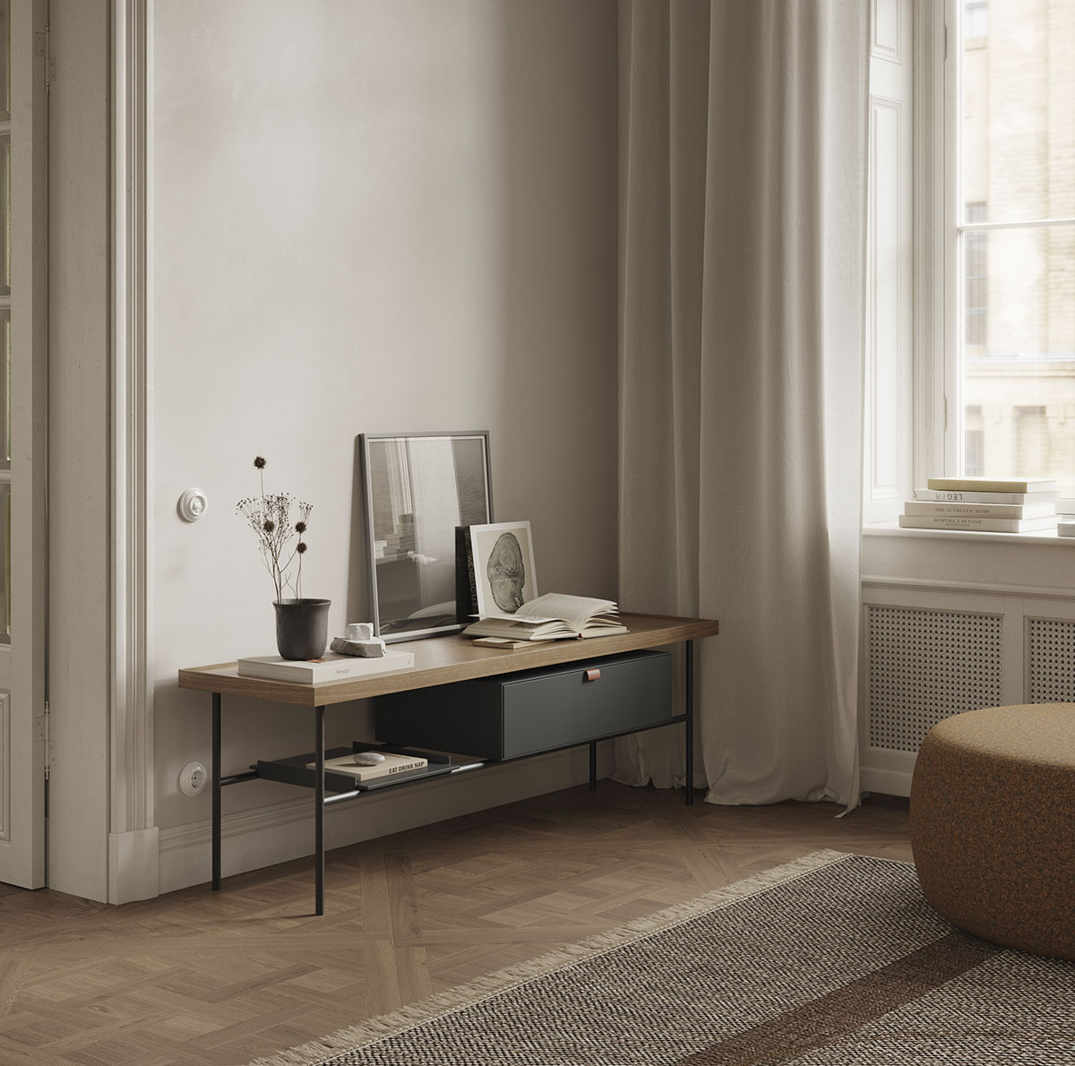
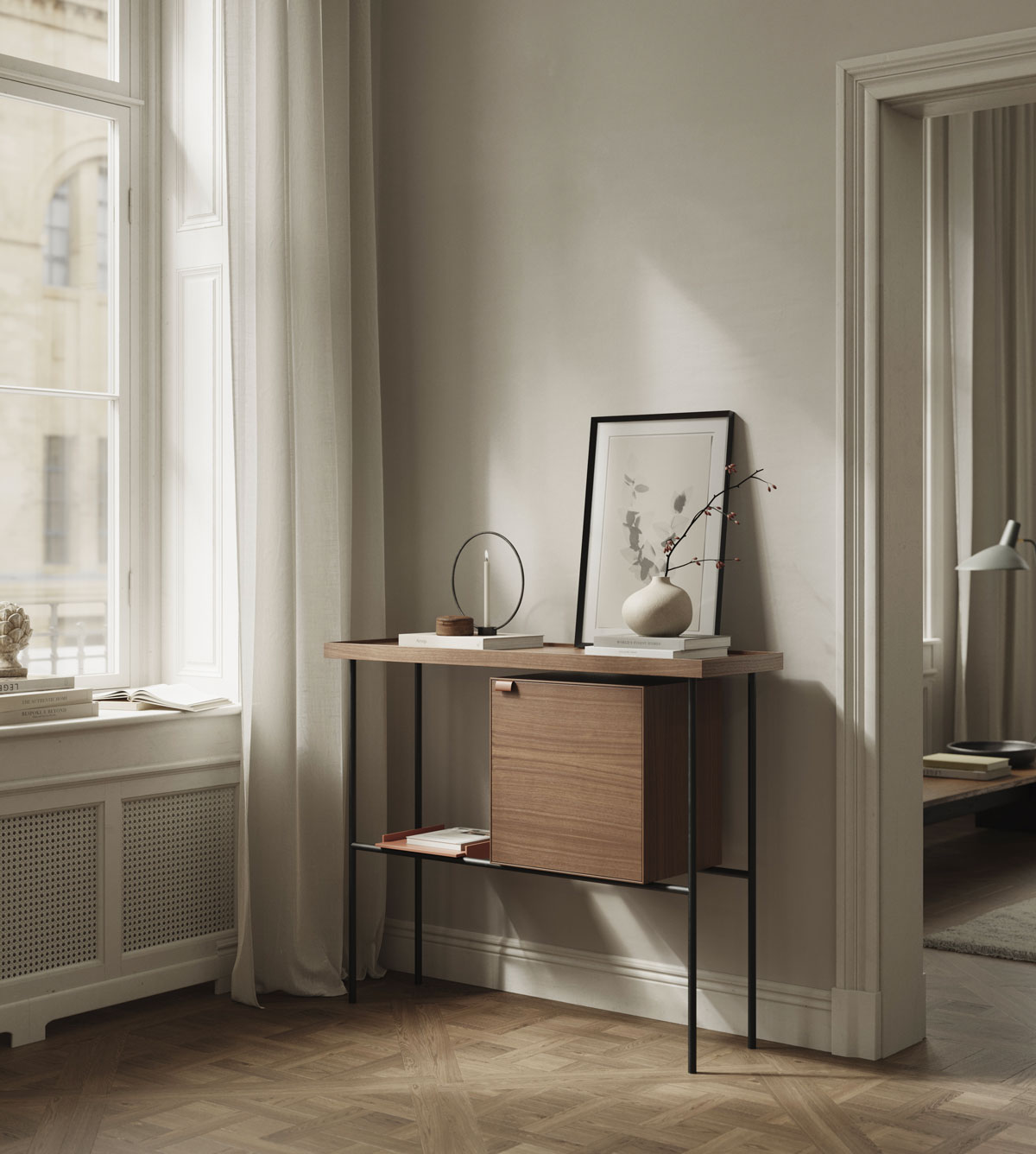
Todos los muebles son piezas complementarias con un mismo hilo conductor aunque, tipológicamente, sean bastante diversas: dos mesas de café de diferentes tamaños, un escritorio y una cómoda muy versátil que puede enmarcarse en muchos espacios.

FOTOGRAFÍA:

(01) Detalle de la bandeja (lacada en color Nude) en el mueble bajo de la colección Kutxa.
(02) Mueble bajo de la coleccion Kutxa con encimera en nogal y cajon en lacado grafito.

La intuición siempre tiene que estar presente en la creación de un mueble. Y la intuición es lo que más se erosiona a medida que se gana experiencia. Por eso es interesante situarse, de vez en cuando, en escenarios creativamente vulnerables que hagan que esa intuición despierte de nuevo.

A medida que consigues objetivos y logras una comodidad puede haber una merma de ilusión, se puede perder el hambre de nuevas ideas. Por ello, siempre es interesante colocarse en situaciones menos cómodas.

Basque Living London

Basque Living London

PHOTOGRAPHY:

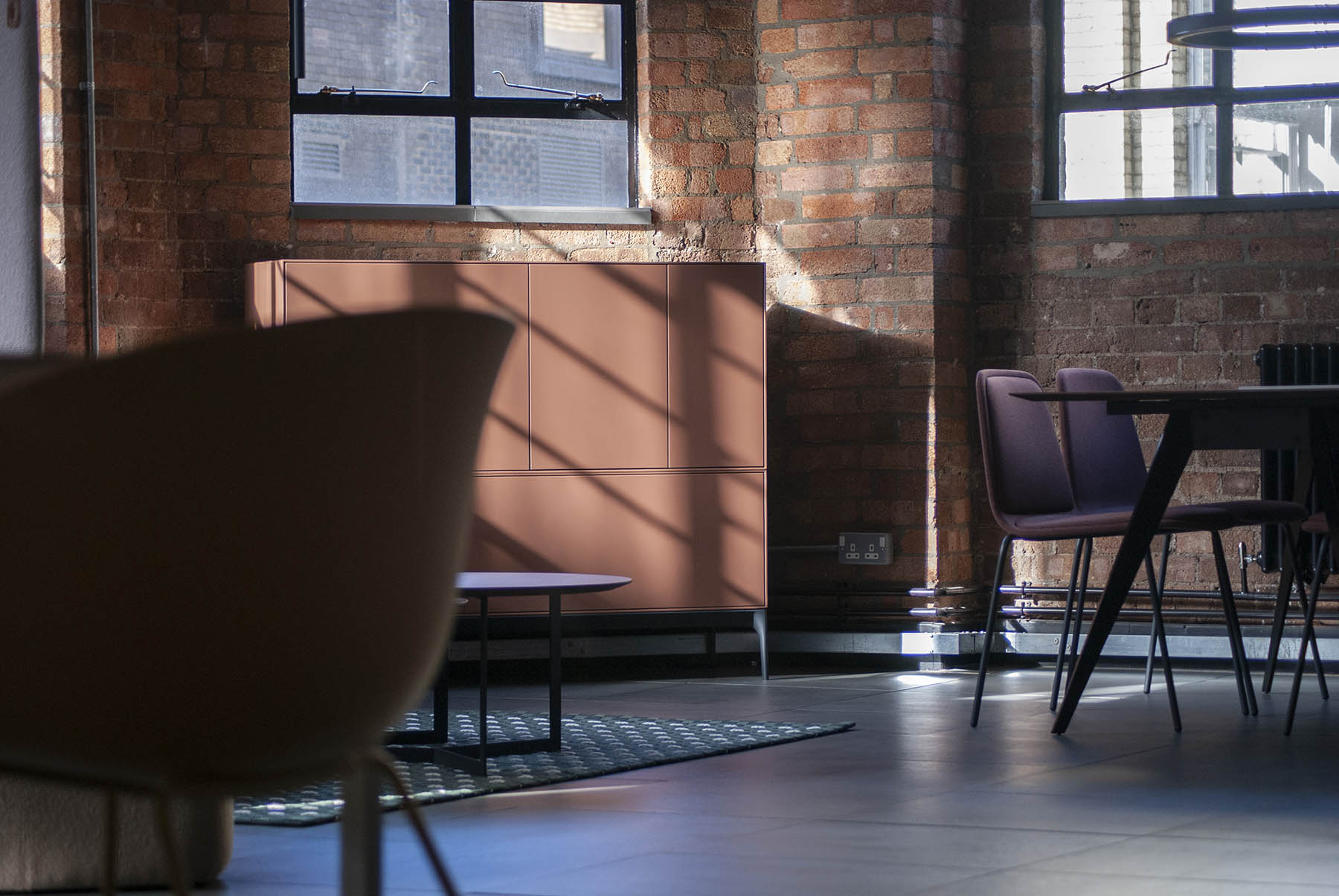
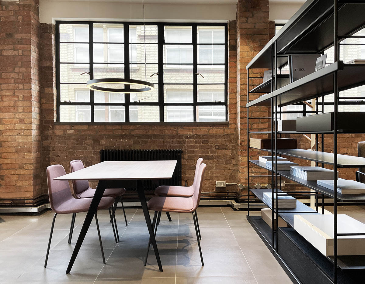
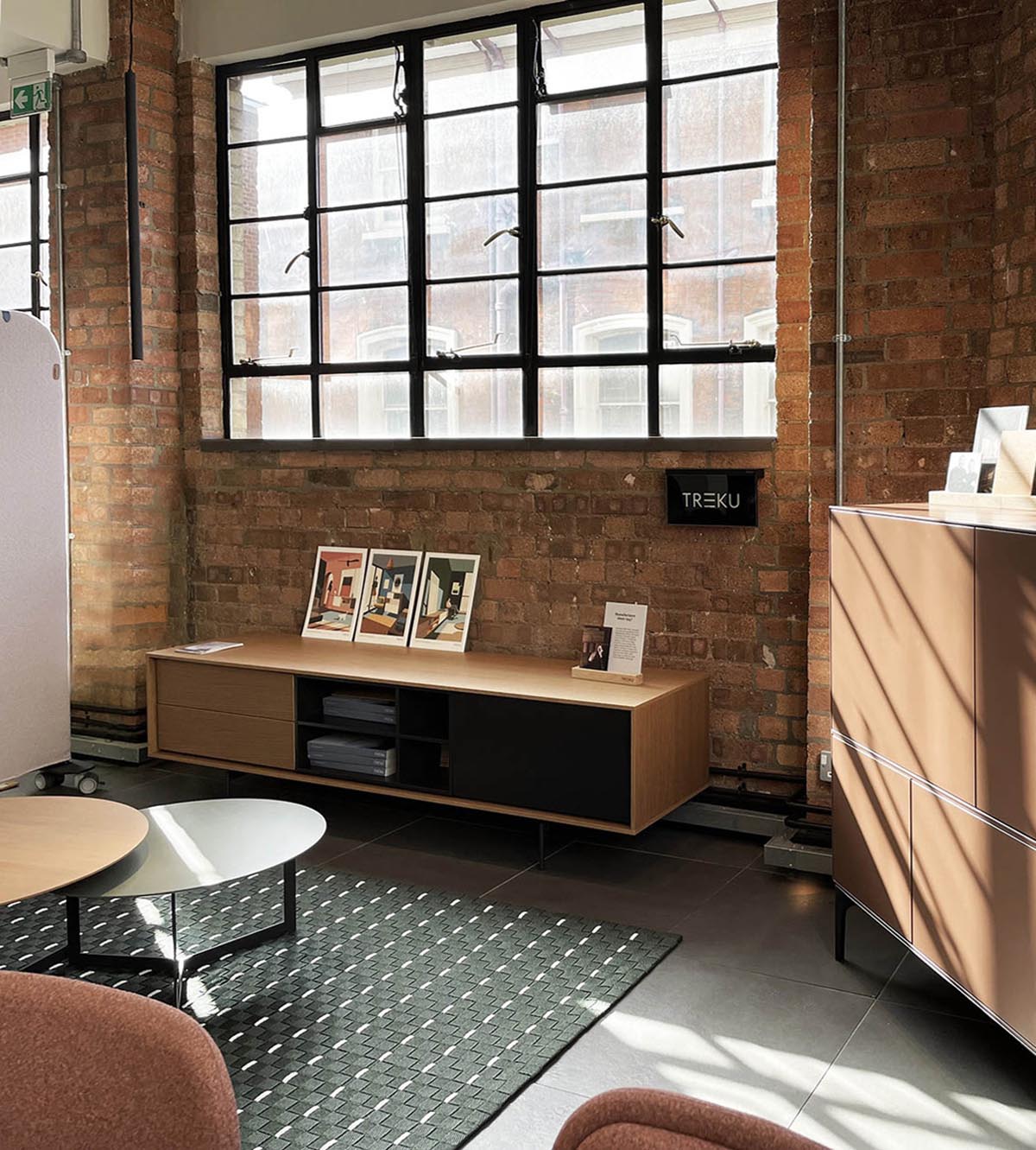
Our different collections among the products of the 8 brands present in the showroom

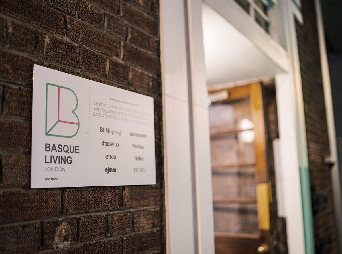
Alongside other Basque design companies, Treku has created the Basque Living showroom in London. Located in the Clerkenwell district, this large-scale project aims to offer architects and interior designers tailor-made solutions for their projects.

Eight Basque brands have joined forces to create this inspiring space, with the aim of offering a broad selection of designer furniture, lighting solutions and household and office equipment, among other elements.

We are delighted to form part of this initiative, which brings together this excellent selection of local companies, and to reaffirm our intention of providing a first-rate service to design professionals working in London, Europe’s leading prescriber in this field.

Further information: Basque Living London

Interview of Ibon Arrizabalaga & Silvia Ceñal

Interview of Ibon Arrizabalaga & Silvia Ceñal

PHOTOGRAPHY:

Ibon Arrizabalaga & Silvia Ceñal

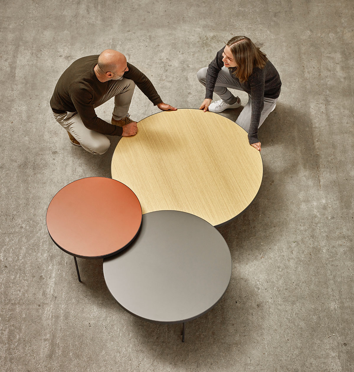
The GAU table is a four hands creation. Hands of the designers Silvia Ceñal and Ibon Arrizabalaga. Silvia trained in industrial design in Spain, the Netherlands and Italy and has worked for years as a freelance. Ibon took his first professional steps with the Seat’s team of designers, and in 1998 began his career with Treku, where he is responsible for the design of household and industrial products.

PHOTOGRAPHY:

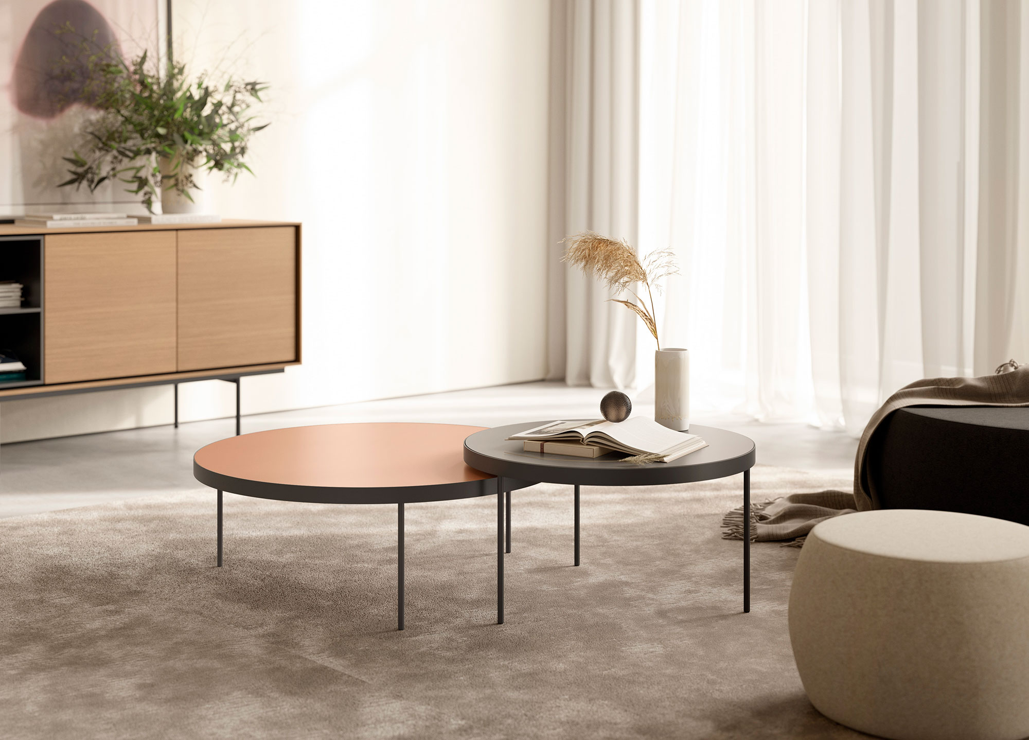
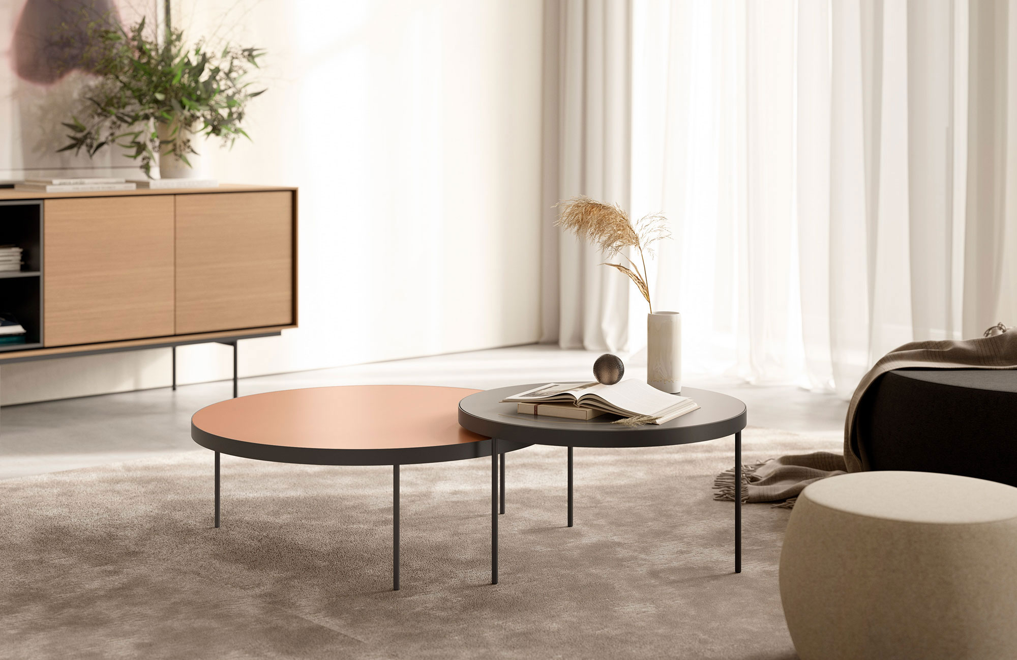
(Above) Gau coffee tables Ø85 height 30cm in brick and Ø65 height 35cm in mink.

How would you define Gau?
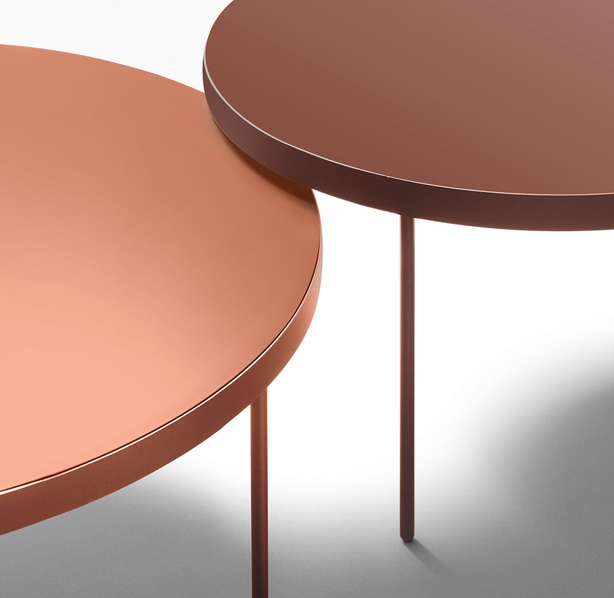
(Ibon) Gau is a round coffee table, simple but elegant, available in three sizes (and three heights) which can be mutually combined. The slender cylindrical legs contrast with the robust ring that surrounds the tabletop and finishes off the piece.
(Silvia) Table is an ideal stand-alone piece, which can be combined with others of different sizes, either as a coffee table or a side table. You can select any wood for countertops and any lacquers from the Treku sample collection, the ring and legs can be selected in any of the available colors.

What would be the ideal setting for Gau?
(Silvia) The Gau line of tables is universal: easily adaptable to large professional areas like offices, hotels, or shops, as well as individual homes. For example, at home they can be used as a coffee table, side table for the sofa or bedside table in the bedroom.

How did you come up with the creation and design of such a product?
(Ibon) On one hand, we generate the ideas and the information that helps us establish certain criteria or requirements from the commercial network. On the other hand, from the product standpoint, we work in a more open and intuitive way to create an interesting portfolio for the brand. What is important is to find the right balance between the two. It is a constant process in which ideas are taking shape organically and are defined, even during the manufacturing process.

PHOTOGRAPHY:

Working on the Gau prototypes

Why did you decide to approach this specific product?
(Silvia) Many of Treku’s products are widely modular systems such as Lauki, Aura, Kai or Bost. Accessories such as Gau tables have another type of importance: they allow us to create atmospheres within the areas in which they are installed. At these times, at Treku we are focused on creating a more dynamic portfolio of these complementary products that allow you to enrich the atmosphere of a home or other type of space.

What are you currently working on at Treku?
(Ibon) Right now we are working on several things. Silvia is focused on developing a dining table, while I am working on a chair and an armchair, objects that I have not had the opportunity to design until now, thus being a particularly exciting challenge.

New Bost Shelving System by YONOH

New Bost Shelving System by YONOH

PHOTOGRAPHY:

Clara del Portillo AND Alex Selma cofounders of the YONOH design studio

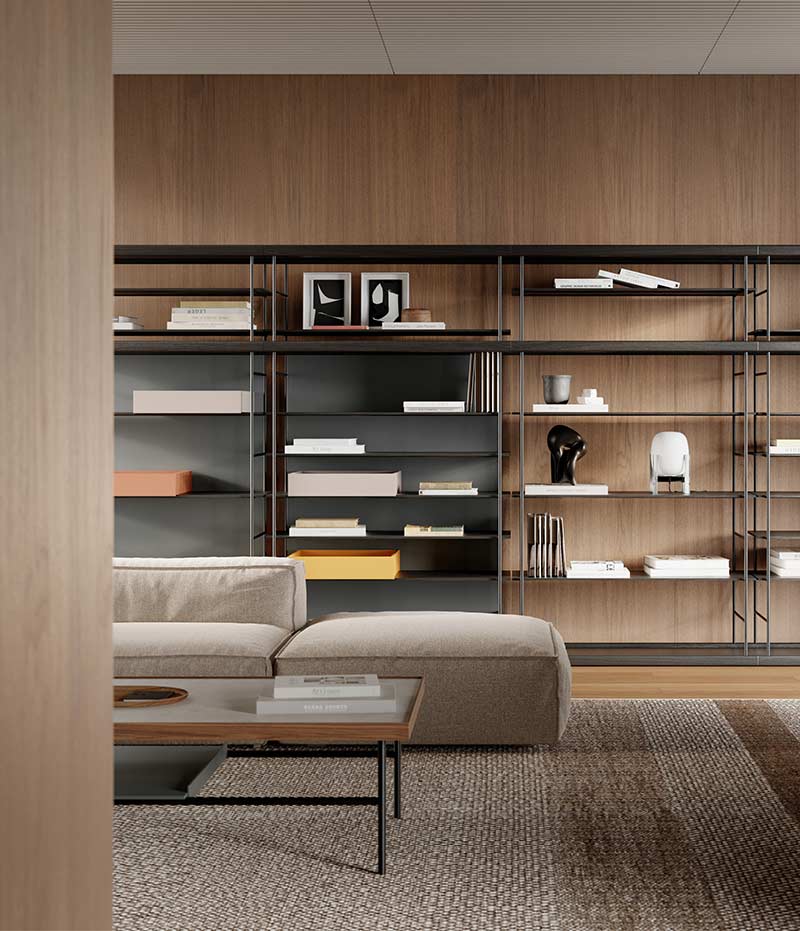
Simplicity, innovation and originality. Without extravagance. This is the philosophy of Yonoh, the creative study that has created the new modular shelf Bost for Treku. The result is a product that harmonizes wood and metal organically and work in different spaces in the home or in the work place. Here is a little interview of the designers of this collection.

PHOTOGRAPHY:

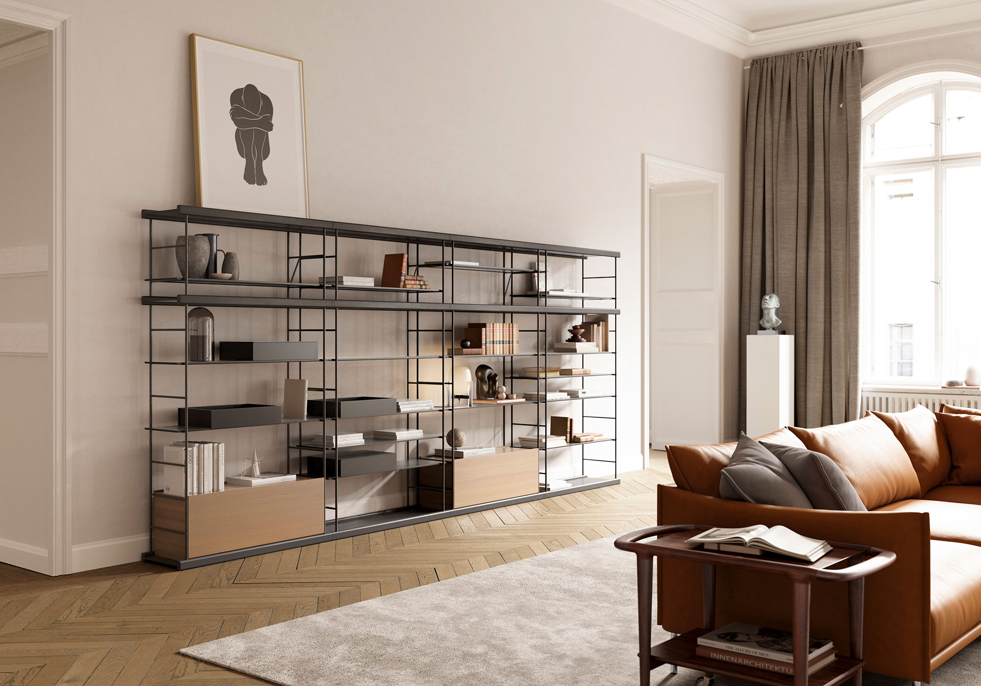
(Above) 2m heigh Bost shelving in walnut and Kai black.

How is a design like Bost born?
Through a process of investigation or sudden inspiration?

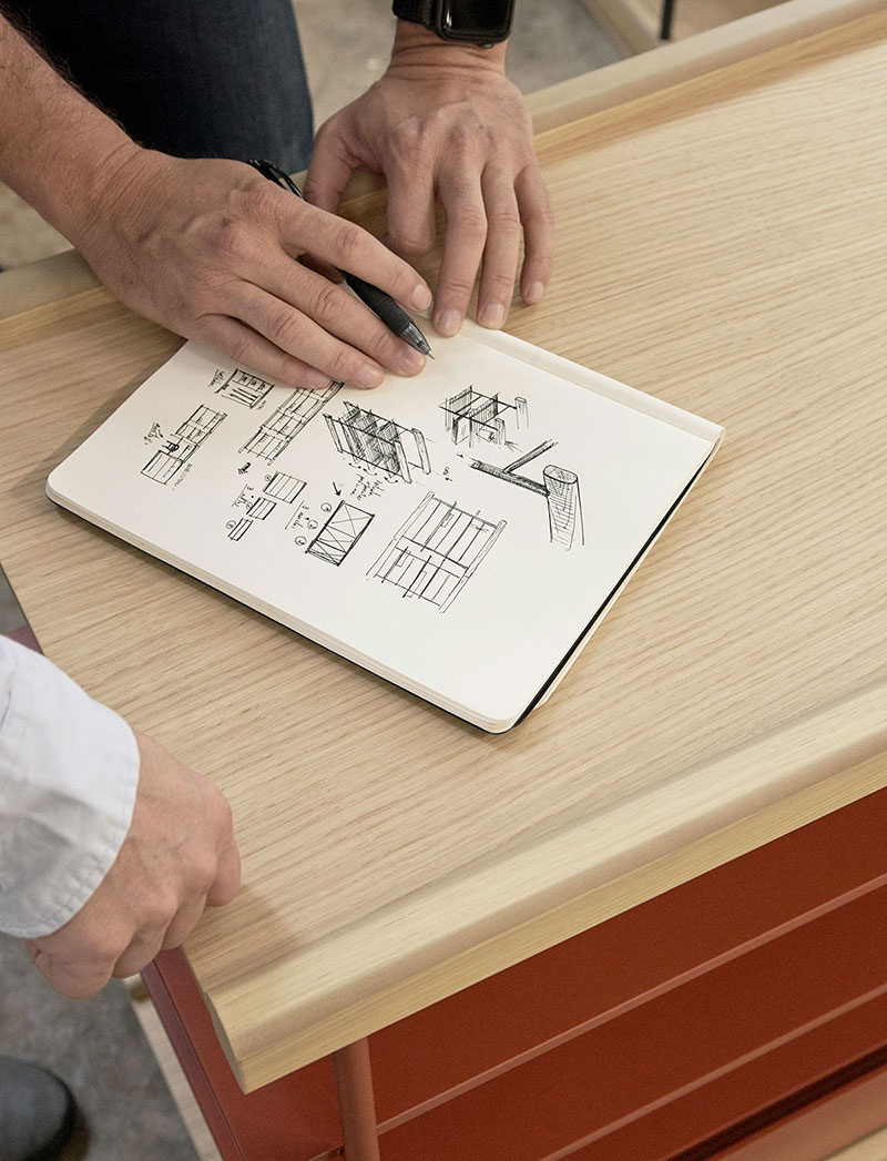
From both. In Yonoh we are constantly developing small concepts that, sometimes, change into big projects. In this case, Bost arose from a formal idea: how to make
a simple model that combines wood and metal in a function way, sober, but with our most organic essence? Little by little we saw the possibilities of the product and the process of investigation took center stage, adding to the family, resolving technical issues, size, material, colors…


Has there been many changes to the final product in respect to the original idea?
There have been very few esthetic changes. The modifications happened when we went into detail: the fact that a collection so multifunctional and combinable has involved an intensive investigation and development to make sure everything functions and fits together perfectly in any situation.


How is the process for a product like this?
Is it digital or artisanal?

Bost is a product that combined 50% of the work digitally and the other 50% through trial and error to understand the dimensions of the product and its modularity. We tried to create a product that was easy to understand with which it was also easy to work with, and because of that we spent many hours working, with the technical development and the physical trials of the pieces.

PHOTOGRAPHY:

Working on the Bost collection prototypes

What is the most seductive part of the system?
Its multifunctionality. You can use a single piece for a small space or a combination of them to cover a large space and still continue to be attractive. We can have 2 heights or one, depending on what we’re looking for. We have accessories so that the piece will identify with the living room, or the entryway, in a bedroom or even a commercial space. We have worked the materials and colors so that they fit within everything from a more serious, manorial environment, to a young space, including childlike. It’s because of that that we like it.


What uses did you have in mind for your design?
Bost, because of its finishes, it’s combination of pieces and its accessories fits in any space. You can use it in a clothing shop for a display, in a bookshop with multiple heights and running the length of the shop, in a living room where it can be combined for different functions or at a lower height as an accessory piece. It’s useful as a support or as a child’s shelving and desk, as a storage system, as a bookshelf, home office including a desk as a piece in the foyer, as a sideboard.

News: Bost & Gau Collections

News:
Bost & Gau Collections

PHOTOGRAPHY:

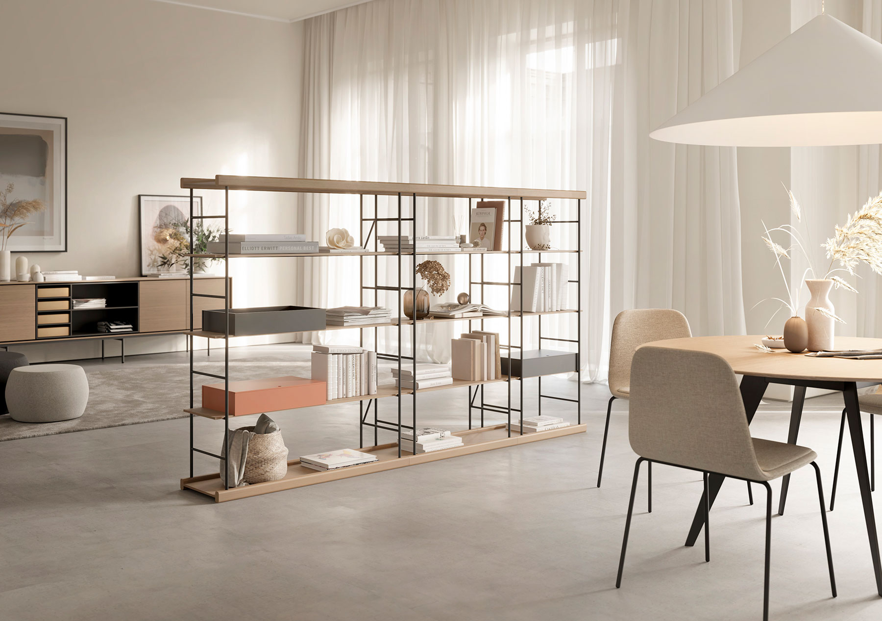
Bost shelving used as space divider in natural oak, graphite and flamingo.

During the january fairs of IMM Cologne and Maison&Objet Paris, we presented two new collections, both warmly welcomed. A new shelving system designed by Yonoh and a family of coffee tables created by Ibon Arrizabalaga and Silvia Ceñal.

PHOTOGRAPHY:

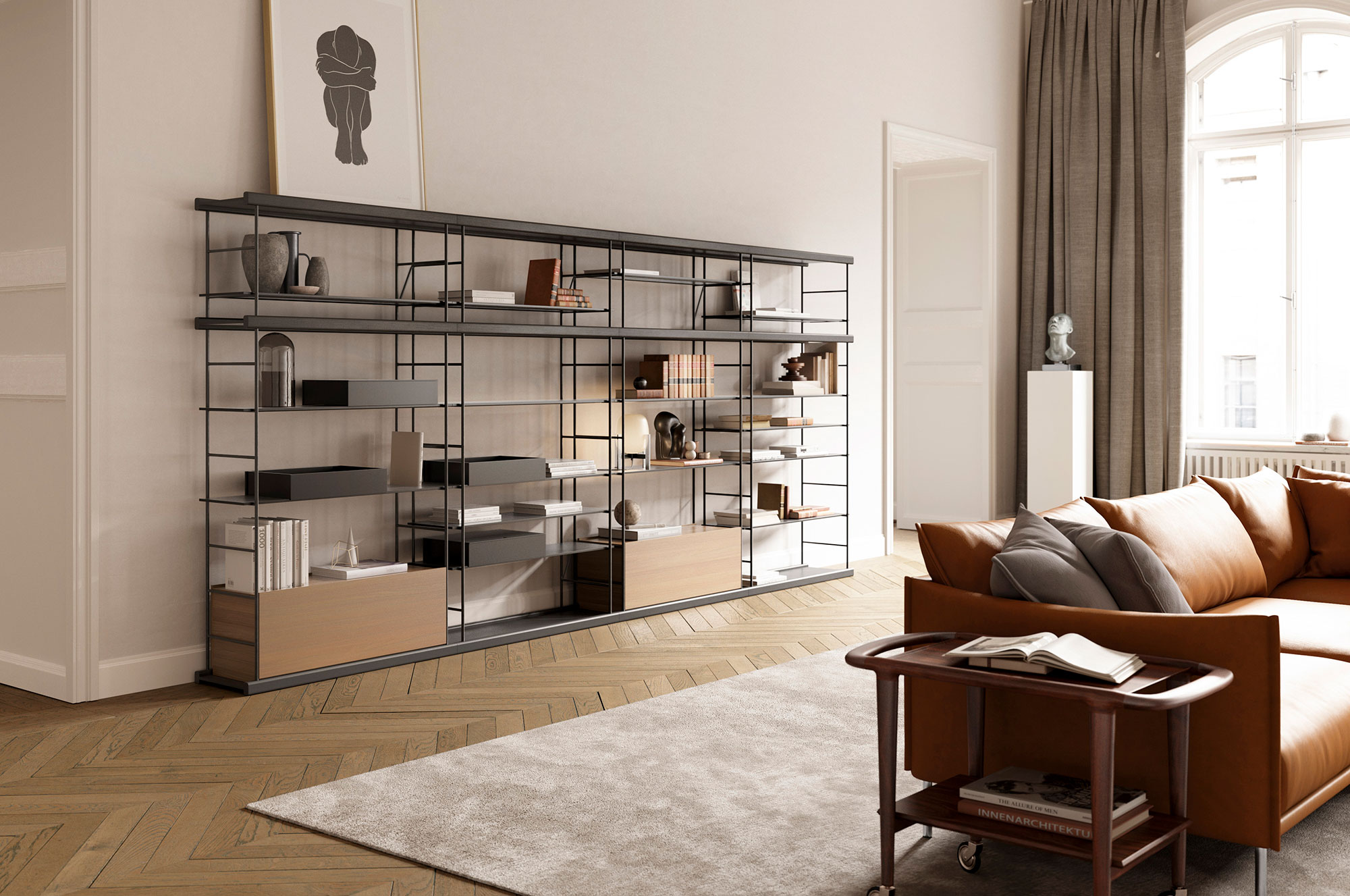
(Above) 2m heigh Bost shelving in walnut and Kai black.

Simplicity, innovation and originality. Without extravagance. This is the philosophy of Yonoh, the design studio that has created the new shelving system Bost for Treku. The result is a product that harmonizes wood and metal organically and fits in different spaces whether in home or work environments.

PHOTOGRAPHY:

(Below) Gau coffee tables Ø85 height 30cm in brick and Ø65 height 35cm in mink.

The Gau table is the work of four hands. Those of the designers Silvia Cenal and Ibon Arrizabalaga. Silvia was educated in Industrial Design in Spain, Holland and Italy and has spent several years working as freelance. Ibon took his first steps as a professional on the design team of SEAT and in 1998 he began at Treku where he is now responsible for the product design team.

Gau Coffee Table Design
Coffee Table metal and lacquers Gau
Coffee Tables in Lacquer and Metal
Silvia Cenal Ibon Arrizabalaga Design